

Automotive Mode for music Streaming
Spotify
Research | Persona | Design Process | User Testing | Outcomes
Purpose
Spotify is a recognized brand and the leading music streaming service and many of these users are logging in on their commutes to work, long road trips, or short stints to the grocery store. It’s no longer a question of if users are logging in while in motion, but how users are interacting with Spotify, while operating vehicles. As of January 2019, Spotify has no dedicated automotive UI for mobile devices. Listeners who don’t have upgraded entertainment systems must rely on the current UI which makes in-a-pinch navigation clumsy, inconvenient, and distracting.
Approach
This project will explore improving Spotify’s player interface for users operating vehicles is imperative for listeners. I will help design an interface that satisfies a Spotify listener’s ability to use the service while in a vehicle, with limited distraction.

LOGISTICS
Category
Concept project pitch for corporate B2C product
Timeline
3 weeks (64 hours)
Full timeline breakdown can be viewed here

RESEARCH OBJECTIVES
Uncover insights and pain points for those using the Spotify mobile app while rushed or within a distracted/high-stakes environment.
Create an undistracted experience while using Spotify mobile.
Embed an automotive feature within the current Spotify mobile platform.
Design a UI for automotive use.
USER RESEARCH fINDINGS
Introduction:
Research was broken into two parts discovering how users listened to any streaming service, while in motion and the second round of interviews consisted of more in-depth research, identifying pain points directly related to Spotify users. 8 participants were interviewed, (targeting Spotify’s two largest age-range groups 19-44).
Prerequisites:
Users who listen to Spotify, in their vehicle, as a primary driver. Alternatively, any users who listen to music/podcasts on any mobile app/entertainment system, while operating a motor vehicle.
Findings and Insights:
Users want a personalized experience
75% of users are looking for a listening experience that is based around their tastes, as opposed to creating their own playlists. For this reason, 62% of users are employing a secondary streaming service (the large majority is Pandora). Many participants expressed that Spotify is less intuitive than Pandora when it comes to music tastes, but also noted that they did not know about or do not use the “heart”/”like”/”dislike” icons. Users either don’t have access to the “heart” icon while driving or they don’t know this icon exists because it’s hidden in the UI.
Users don’t feel comfortable using the native app, while driving
Half of the participants don’t feel comfortable navigating Spotify’s native user interface. This may be due to button size, screen clutter, ‘mistapping’, phone size, layout confusion, or it being a general distraction while driving. Many users are tossing their phones onto the passenger seats or in the middle console as a way to deter the distraction of fidgeting with Spotify. Some users are relying on an entirely different interface via their phone’s widgets or their vehicle’s info system. This, however, impacts some users ability to access the “heart” icon or their ability to see artist names and song titles. The users that do feel comfortable using Spotify’s native interface still experienced ‘mistaps’.
Regardless of comfort level users are still navigating
It turns out that comfort level doesn’t necessarily impact a user’s desire to navigate. Half of the participants still navigate Spotify while driving, even if they don’t feel confident or safe doing so. What’s more telling is half of the participants expressed some form of frustration in navigating through text and image heavy playlists, while they drive. Most users have a significant number of playlists and therefore are unable to find what they’re looking for in a short amount of time while operating a vehicle. The more playlists a user has or the more users relied on curated playlists directly coincided with the amount of frustration a user feels during a search.
Goals and Needs:
A continued personalized experience uninterrupted by streaming while driving.
Safety.
Unhindered navigation.
Custom needs based on the nature of the listener’s commute.
Overall:
User phones differed throughout
8 out of 8 users want a personalized experience
6 out of 8 users rely on curated playlists
5 out of 8 users employ more than one streaming service
4 out of 8 users felt comfortable using the interface while driving
4 out of 8 users rely on a secondary interface as opposed to Spotify’s native interface (i.e. a widget).
4 out of 8 users did not know the heart/like button exists
4 out of 8 users expressed frustration around navigating to and through playlists
4 out of 8 users search while they drive
3 out of 8 users did not have access to heart/like button while driving
3 out of 8 users docked their phones
3 out of 8 users complained about button size or ‘mistapping’
2 out of 8 users felt there was clutter or confusion around Spotify’s interface
PERSONAS

Ideation & storyboard


Ideation and Storyboards were done by way of using a technique called “Crazy 8’s”. 117 sketches were made to uncover solutions.
These solutions were delineated by trying to solve three problem statements:
How might we continue to facilitate a tailored listening experience, in the car
How might we prioritize less distracted driving within the Spotify app
How might we create a simplified UI
Reducing distracted driving while still promoting a tailored music streaming experience became the overarching design priority.
Solutions started to reflect the allowance of user centered choices as to how they individually use their UI, given changing scenarios.
USER FLOW

This happy path follows a user flow in which a Spotify listener turns on the Auto Mode feature. The user may edit the layout of their Auto Mode UI, dependent on the nature of their commute.
WIREFRAMES


Lo-fi Wireframes were employed to quickly sketch out solutions found during ideation.
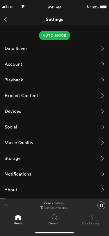
Home: the classic Spotify home screen with a cog wheel that navigates users to the settings page (wherein the Auto mode would be found).
Settings screen: A Auto Mode button will be added at the top of the screen.
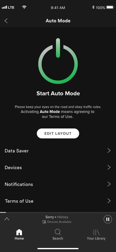
Auto Mode: This settings screen will allow users to edit their respective layouts or begin using Auto Mode.
Edit Layout/Add Tile: Editing the Auto Mode layout using tiles which can be added or removed with 4 tiles total. Each tile has a different function, some which already exist in Spotify, some newly created which would benefit a user after they reach their destination (such as ride review — a history-like feature what shows previously played tracks from the moment Auto Mode was turned on until it was turned off).
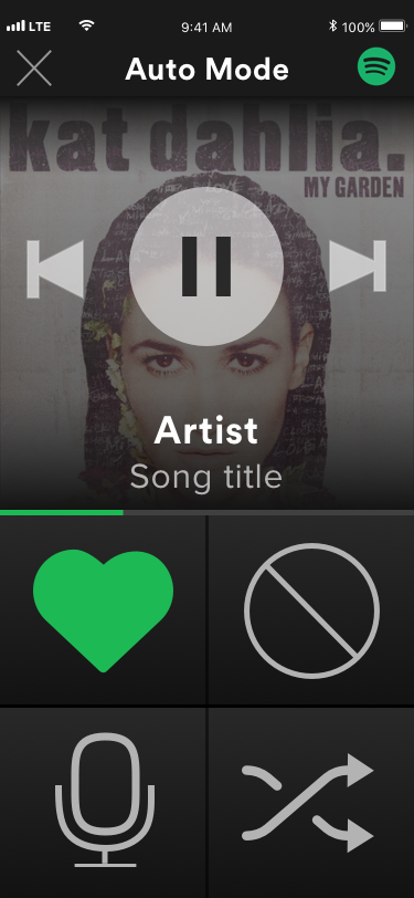
Auto Mode ON: Auto Mode UI showing 4 chosen tiles, player buttons, artwork, large text display, and an On/Off button.
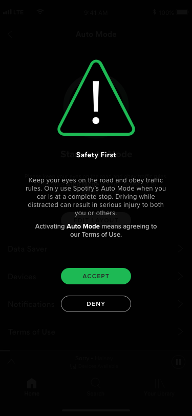
Disclaimer Screen (not shown): Users will need to accept or deny using this feature and agreeing to keep safe on the road.
UI DESIGN


Iteration from lo-fi wireframes:
Layout of ‘Edit tile page’ has been condensed into one: edit auto mode.
No + or - buttons on tiles to remove tiles. Redesigned to drag and drop.
Edit Auto Mode only shows a preview of the tiles, not the entire Auto Mode layout screen.
Scrub tile has been removed.
Clock tile has been added.
Look Back tile has been added (feature which is out of the scope of this project).
Ride Review has been removed.
MOCKUPS


USABILITY TESTING
Test Objectives:
Identify the speed in which users can navigate to the Auto Mode page
Assess the findability for Auto Mode
Assess the navigation and learnability of participants adding and removing a tile
Test Participants:
4 participants. Targeting Spotify’s two largest age-range groups 19-44. Users who listen to Spotify, in their vehicle, as a primary driver.
Methodology:
Participants will be given a clickable prototype (found here) and will be given a task. Participants will be asked to complete the task, talk through their behaviors, and will be gauged on how they meet the objectives.
NOTE: The drag and drop feature was not added to the clickable prototype, as this is a limitation of InVision.
Recruiting plan:
Many participants are those who were interviewed for user research. Others will be volunteers pulled from Slack and social media platforms, who meet the participant prerequisites.
Tasks:
Participants will be tasked with navigating to the Auto Mode page, remove the ‘repeat play’ tile, add in the ‘voice command tile’, start Spotify’s Auto Mode, and heart a track.
Test Completion Rate:
4 out of 4 users were able to complete all tasks creating a 100% success rate.
USABILITY RESULTS
All users were able to complete the task, many stating it was inherently obvious as to what each page did. All users were able to add and remove tiles, with little trouble. 4 of 4 users were able to heart a track. Over half of the participants commented on the need for tile labels as these icons could be ambiguous to a first-time user or someone not familiar with iconography. This was especially true for icons like “history” and “playlists” (features that don’t exist in Spotify, currently). Over half of the participants commented on the “start” button being difficult to distinguish as an actual button as opposed to a graphic. However, 3 of 4 participants bypassed the button, starting Auto Mode using the upper right icon, within the edit tile layout page. The start button/graphic confusion may not be the case, given a scenario where a user is starting up Auto Mode, without editing the layout. Finally, 3 of 4 users were able to complete the tasks in under 30 seconds.
AFFINITY MAP

Overview of uncovered successes, pain points, and suggestions of each page tested during the usability testing.
Next Steps
Spotify’s auto feature design will continue to be iterated so that it’s easier for first-time users to understand. A button to get directly to the “auto mode” page may needed to be added to the homepage (understanding that not all users will employ this feature means that user testing must continue to define the need for this button). Interactivity plays a major role for this features to be successful — for instance when hovering over tiles a label identifier is a must, the large “start” button needs to have some animation against the static screen to give it motion and look clickable, drag and drop abilities within the edit tile layout page is necessary. A second round of user testing will be completed after considering the success rate of the next design iteration. After objectives and goals have been met, new auto-centered features such as the Ride Review or Look Back pages may be added, designed, and prototyped, dependent upon on their need during a research plan based around feasibility and need.
HUNGRY FOR MORE PROJECTS?
Get your fill here